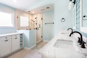
Since it’s Transformation Tuesday, let us share this Master Bathroom Renovation.
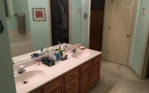
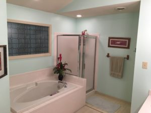
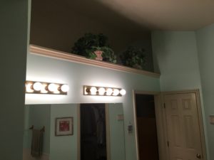
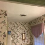
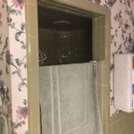
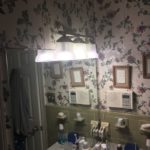
Before: The original master bathroom was a pretty small space with one sink, a small shower and only one small window. Overall space was very dark and clustered, not functional, and least to say -outdated. Our client’s main request was to open the space and make it bright and airy. At the same time, the owner wanted to make sure that the new master bathroom would fit with the design of the rest of the house originally built in the late seventies.
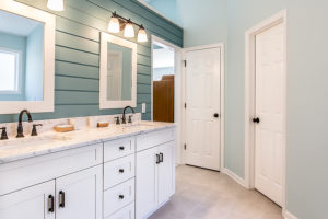
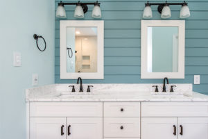
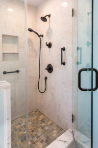
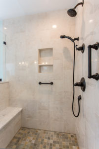
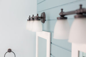
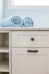
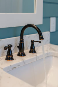
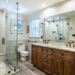
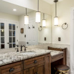
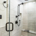
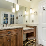
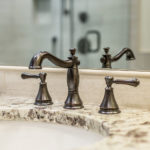
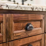
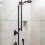
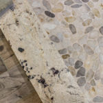
After : To create the feeling of a bigger space, it was decided to remove the shower walls, linen closet area and separation walls. We added the double french doors, installed recessed lights and pendant lights for the make-up area . The double sink feature and and a large mirror helped to visually make the new bathroom even bigger. For the shower area we installed a rain and a hand held shower heads, a bench and glass doors. For modern rustic look, we chose the trim in Venetian Bronze. Both the floor tile and the shower tile were chosen in the colors to compliment the wall paint color and the granite over the double vanity.
.
